
There is a moment every business owner faces at some point in their digital marketing journey. You create content, show up on social media, maybe even go viral, only to realise something frustrating: attention does not equal conversions. A video might hit a million views, but that does not automatically translate into sales, bookings or leads. A funny TikTok is great for visibility, but not always for revenue.
This is where UX and UI design become critical. Good UX and UI turn traffic into action. They guide customers smoothly from the moment they land on your website to the moment they convert. And in a world where customers expect convenience, clarity and instant value, a well-designed website is no longer a nice-to-have. It is the frontline of your brand.
Customers land on your website with intent. They want answers, reassurance and proof that you can deliver what you promise. Your job is to make that journey as clear and compelling as possible.
In this guide, we break down five updated and practical UX and UI improvements you can make today to boost conversions, reduce friction and increase the return on your digital investment.
Before diving in, remember this. Your website is not just a brochure. It is a sales system. When designed well, it can work harder than any post, ad, or trend ever will.
Here are five UX and UI principles to help you convert more visitors into paying customers.
1. Craft Clear and Purposeful CTAs
Every page on your website should guide your visitors toward a specific action. But many businesses fall into the trap of using the same generic CTA across multiple pages. A ‘Learn More’ button repeated everywhere provides no direction. It blends in and requires the visitor to do the mental work.
Clear, specific CTAs remove decision fatigue. They tell users exactly what happens next and why it matters.
Examples of stronger CTAs include:
- Get My Free Quote
- See Pricing for Your Project
- Book My Strategy Call
- View Before and After Results
- Explore Packages
- Download the Buyer Checklist
Notice how each CTA communicates an outcome or benefit. It feels intentional, not passive.
A simple best practice is to use unique CTAs for different stages of your homepage. The top section might offer a free assessment, while the middle section can direct people to your service pages, and the bottom section might encourage them to read case studies or enquire.
Well-crafted CTAs are one of the highest impact UI improvements you can make, especially if your current ones are vague or repetitive.
2. Use High Quality Visuals and Interactive Elements
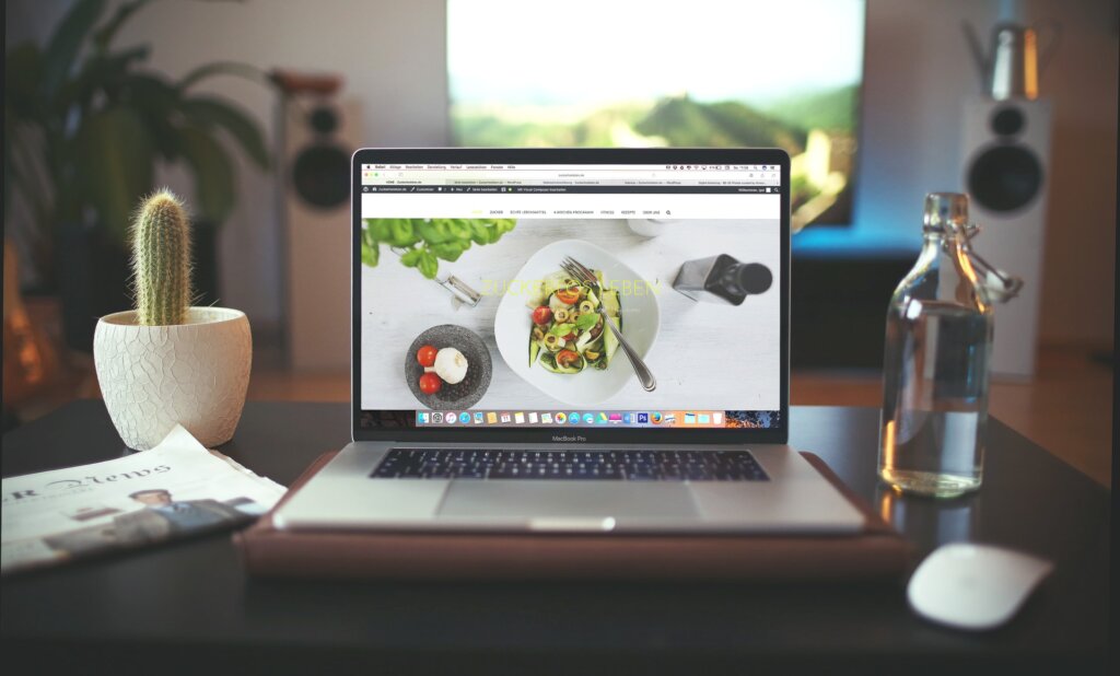
Visuals are among the fastest ways to communicate trust and value. Whether you sell products or services, strong imagery helps customers envision what they will receive and reduces the mental friction of decision-making.
If you are an e-commerce brand, this means investing in:
- High-resolution product photography
- Zoom functionality to view details
- Multiple angles and lifestyle shots
- Short product videos or try-on clips
- 360-degree views for complex items
These assets do not just look good. They help customers make informed purchasing decisions. The clearer the product, the higher the confidence.
If you are a lead generation or service-based business, high-quality visuals are still essential, but the format shifts. Examples include:
- Explainer videos showing your process
- Simple diagrams or infographics
- Before and after imagery
- Quick animations demonstrating how your service works
- Visual proof of expertise, such as team photos, location shots or project walk-throughs
People process visual content faster than text. A strong visual strategy not only enhances UX but also anchors your authority. The more clearly customers understand what you offer, the more likely they are to convert.
3. Create a Clean Layout That Guides Attention
A clean layout is not just about aesthetics. It is about controlling attention, reducing overwhelm and helping visitors find what matters most.
Users leave cluttered sites quickly. They do not have patience for visual chaos, confusing navigation or competing focal points. A clean design creates calm and increases the likelihood that users will stay, scroll and take action.
Here are three principles to follow.
Use Negative Space to Direct Focus
Negative space, or white space, is one of the most effective design tools available. When used intentionally, it highlights your most important content and reduces cognitive load.
This is supported by research. According to Crazy Egg, well-applied negative space increases user focus by 20 percent.
Spacing is not empty. It is strategic.
Prioritise Readability
Readable content keeps people engaged. Customers skim before they commit, so your page must be easy to scan.
Best practices include:
- Short paragraphs
- Clear headings and subheadings
- Bullet points to break down information
- Consistent hierarchy
- Simple, conversational language
- Contrasting colours for clear text visibility
Avoid thick blocks of text. They create friction and fatigue. Make your content effortless to consume.
Choose Typography for Accessibility
Typography impacts trust and usability. Thin, decorative or overly stylised fonts can hurt conversions, especially on mobile.
Choose fonts that are:
- Clean and easy to read
- Visible across all screen sizes
- Large enough for mobile browsing
- High contrast against backgrounds
Good typography enhances scannability and strengthens your brand presentation.
4. Streamline Click Paths

Your customers are busy. They expect fast, intuitive experiences. That means the journey from landing page to conversion should be as short and seamless as possible.
A long click path kills conversions. Too many steps give users time to hesitate, rethink or abandon.
A good rule of thumb is this: customers should be able to reach your key product or service pages within two to three clicks.
Here is how to shorten click paths:
- Use clear top navigation menus with simple categories
- Group similar services under logical headers
- Add filters for e-commerce to help narrow product selection quickly
- Reduce unnecessary form fields
- Use quick view options for products
- Create landing pages that answer the most common questions immediately
Better UX leads to stronger SEO performance. When pages are easy to reach and navigate, users stay longer and bounce less. Search engines view that as a positive signal and rank your content higher.
Shorter paths equal faster decisions and more conversions.
5. Improve Your Site Speed
Site speed impacts everything. User experience, conversion rates, search visibility and even ad performance are all affected by how fast your website loads.
Research shows that if your page load time exceeds three seconds, around 40 percent of visitors will leave. That is almost half your potential customers lost before they even see your offer.
Slow websites also increase ad costs because platforms like Google reward fast, optimised pages. A slow site can reduce Quality Score, drive up cost per click and decrease conversions.
Key ways to improve site speed include:
- Compressing images without losing quality
- Using next-generation formats such as WebP
- Removing unnecessary plugins
- Using lean, optimised code
- Enabling browser caching
- Upgrading hosting
- Minifying CSS and JavaScript
Fast websites convert better. It is one of the simplest ways to boost performance across every marketing channel.
Summary
UX and UI are the backbone of a high-converting website. They transform passive visitors into engaged users and ultimately into customers. While good design looks impressive, the real value lies in functionality, clarity and the thought behind each element.
When you optimise your website for usability, readability and flow, you not only increase conversions but also improve brand perception, trust and long-term performance.
To recap, strong UX and UI come down to:
- Clear CTAs that guide behaviour
- High-quality visual content that builds confidence
- Clean layouts that focus attention
- Short, intuitive click paths
- Fast load speeds across all pages
If you want to convert more casual visitors into paying customers, start by improving the experience they have on your website.
And if you want a team that can do the heavy lifting for you, our UX and UI specialists at Advisible can help.
For Adventure Wild alone, our redesign delivered:
- 565 percent increase in users
- 188 percent increase in conversion rate
- 496 percent increase in sessions
This is the power of combining strategy, design and performance in one cohesive experience.
Ready to increase your conversions?
Contact us now and let us transform your website into a high-performing asset for your business.


