
It’s easy for anyone with some basic computer competency to make a website. There’s so many options out there to simply ‘fill in the blanks’ into a template and ‘vuala’, you’ve got yourself a new website. More often than not though, these websites don’t provide much value, other than just getting your business online. When you’re in the process of getting a website made, you have to think to yourself, what is the point of my website? What are my goals? What do I want this site to do for me?
Every website has a conversion goal, whether that be online sales, to generate enquiries, or to simply sign people to a newsletter. That’s why, when creating a new website, you have to keep your goal in mind and focus on objective based design. There are certain factors to consider with objective based design, and design that converts.
1. Simplicity
You may think that cramming a ton of graphics, content and anything else you can think of means that there’s bound to be something that will attract your visitors right?
Well this isn’t the case. If you’ve done the above, you’ve most likely smothered your visitors with an overload of cluttered content. Nobody likes sorting through clutter to find what they need, as a result most will just bounce off your site.
Simplicity is key. Keep your design simple and objective based, give people information that that they need to know, and make any interaction (such as an enquiry form) short, simple & as least time consuming as possible.
2. Call To Actions
You can have a simple, immersive and fast loading website, but without any call to actions, what’s going to entice your audience to become more than just your audience?
A call to action is pretty much an instruction to get your viewer to complete a desired action on your site. It seems like this should be child’s play, but I always see call to actions hiding behind annoying, confusing & useless information.
To be effective, your CTA needs to be clear, it needs to stand out, and it should be visually engaging. This way, it will lead your audience to complete your desired action quickly, and you can watch your conversions grow.
3. Load Times
There are many factors that Google uses to determine your websites rankings. But it’s a well known fact that they’re obsessed with site speed. Nothing kills user experience more than a website that takes ages to load.
I’m sure we’ve all encountered websites that take way too long to load. More often than not people will leave a website if it takes too long to load. This means you’re losing potential customers just like that, before you’ve even been able to truly show what your business has to offer.
With mobile taking over as the main medium for online search, it is more important now than ever to have a website that loads fast.
A good tool to use to test your website’s speed on various devices is the Google Developers Page Speed Insight Tool.
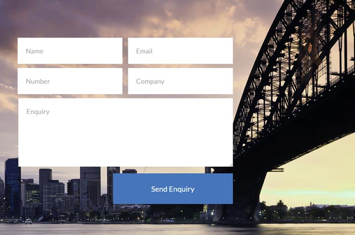
4. Contact Forms
Contact forms are one of the best ways to get your audience to get leads. You can use a contact form to get order or information requests, feedback, quote requests, or just questions.
Keep your contact form simple. Avoid your contact form becoming a questionnaire. The point of a contact form is to be convenient, especially for people who don’t have the time to enquire over the phone. Keep the form as short as possible and make it stand out to the user.
Short and simple contact forms like the one below work best.
5. Focus On Engagement
Flashy graphics that slide across and bounce all over your screen are not engaging. More often than not they just annoy your audience and tarnish any hope of these leads converting, or ever coming back to your site.
First impressions matter on websites as much as they do in real life – face to face encounters. We live in a world where convenience is key and attention spans grow shorter and shorter. If you can’t grab your audience’s attention in the first 5-10 seconds of them visiting your website, you might as well say goodbye to that lead.
Parallax scrolling is a great way to not only grab the initial attention of your audience, but also keep them engaged as they scroll through your website. This technique is when background images on a website move at a slower speed than the foreground images/content while scrolling. It adds an immersive illusion and to be honest, if done right, it’s just really pleasant for the eye.
You can also add videos and pictures to engage your audience on a personal level. There are many ways to engage with your audience. Just be smart with it, align it to the goals of your website and think back to point 1, keep it simple!
—
There are plenty of companies out there that can make you a website, but not everyone knows what they’re doing. Be careful when choosing who’s going to build your site, after all your website is your online showroom, and the basis of your success online.


