Ready for Adventure with 565% Website Traffic Growth!
- 0 Increase in Users
- 0 Increase in Conversion Rate
- 0 Increase in Sessions
Project Overview
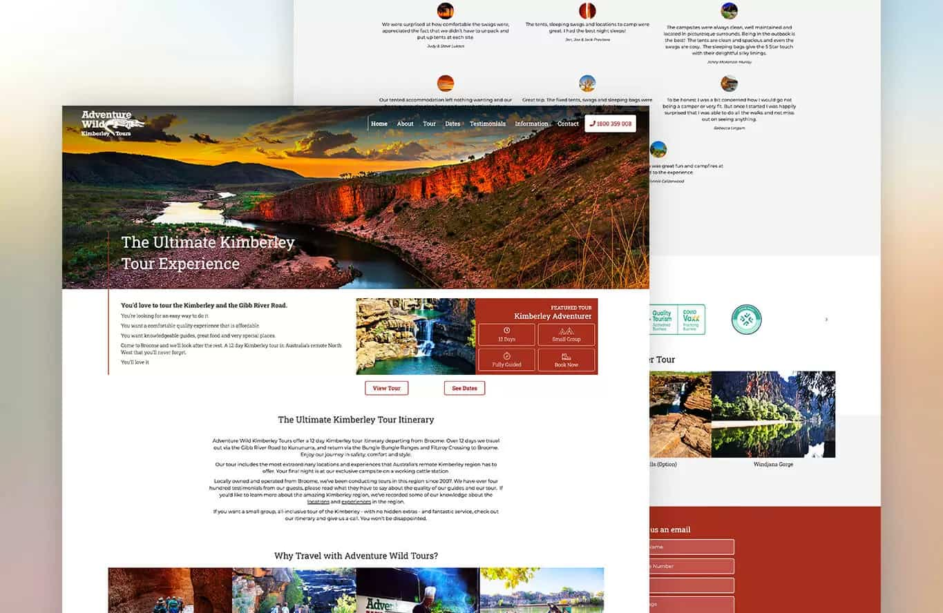
Adventure Wild are Western Australia’s premier outback tour specialists, who are focused on creating memorable experiences for travellers. AdVisible created a compelling Google Ads campaign with Adventure Wild. After building some trust with the strategy, we encouraged the client who was new to digital to also renew their website.
Our Proposal
While Adventure Wild was getting some traffic organically for their Kimberley tours, the vast majority of their traffic would leave without engaging much with the site. Understanding the impact that a website re-design can have, we believed the web designers in our agency could deliver a powerful solution.
Objectives
- Encourage users to stay longer on the website
- Increase the number of pages each user visits
- Improve their brand presence and reputation
- Drive sign-ups for outback tours
Strategy & Awareness
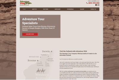
Adventure Wild’s initial website had a dated appearance with an earthy historic but ‘flat’ theme, which translated to a high bounce rate and not many conversions despite any traffic they got on site. We wanted to give them a glow-up with an engaging new theme and a streamlined layout that would make their offers more appealing than ever.
Issues included:
- Outdated visuals
- Cluttered information and visual layout
- Low readability score content
- Web design not optimised for user experience
Our Approach
Streamlined Layout
The original website design had large slabs of information, particularly on the homepage. We;
- Shortened content
- Added more larger subheaders
- Created shorter modern sections optimised for scrolling on desktop & mobile
This helped create a website that was easy for users to glance and browse through.

Updated Visuals
We understood Adventure Wild’s audience. We knew we needed to go for rich visuals that inspired readers to go on tour (and interact with the website). We;
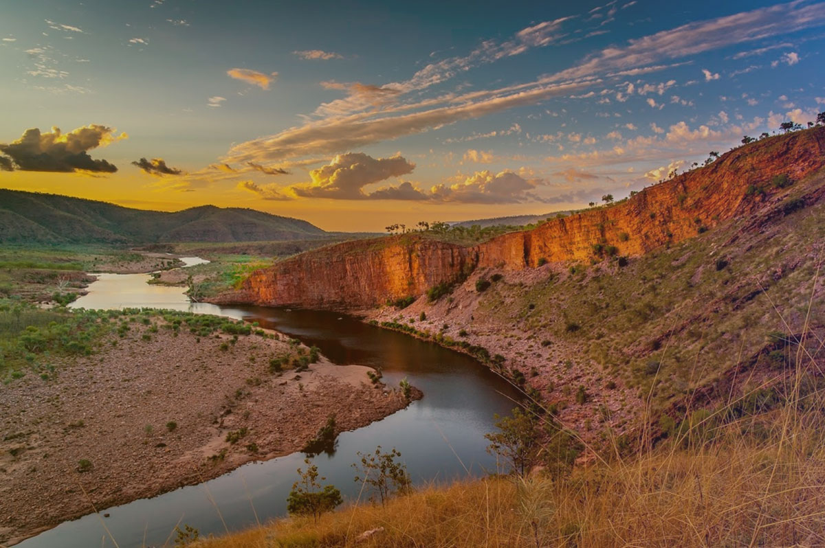
- Selected a rich and vibrant header photo to cause users to pause on the main page
- Added consistent high saturated images throughout
- Photos of people in tours, so users could see themselves joining them
The result: more user activity! With a 385% increase in pages per session.
Frequent Calls to Action
The client initially had few CTAs on their homepage with very similar wording: learn more or enquire. We aimed to shorten the user’s commercial journey with these steps;
- More specific call to action buttons
- Added rich visuals above every CTA button
This made each ‘offer’ more engaging and better aligned page navigation with search intent.

Testimonial Filter
Previously, only two testimonials could be displayed at a time. We wanted to showcase all Adventure Wild’s happy customers had to say;
- Put more testimonials on the homepage
- Created a filter so users could get specifics on camping, food, guests, etc
This change helped highlight all the incredible achievements of our client, in a clean sleek format! (And it didn’t hurt for conversions!)
Updated Colour Palette
The client’s old homepage colours were heavy in the cool browns. While it was reminiscent of the earthy hues of Broome, we knew we could make it more engaging;
- New desert red theme
- White and light grey backgrounds
This update helped divide sections and maintain focus throughout the page.
The client’s old homepage colours were heavy in the cool browns. While it was reminiscent of the earthy hues of Broome, we knew we could make it more engaging;
- New desert red theme
- White and light grey backgrounds
This update helped divide sections and maintain focus throughout the page.
Google Adwords Management
Google Ads was our initial campaign with Adventure Wild, which joined with traffic, really helped the site to convert and rank. We maximised reach while minimising cost by;
- Enabled location targeting
- Focused on top-selling offers
Our strategy meant more qualified traffic. For increased conversions and activity, while lowering bounce!
Results So Far
Ready to grow your business with the best digital marketing agency in Sydney?
Request your free audit today. We’ll increase your visibility, drive more leads and skyrocket your sales.
